The quiet design language of fine-line tattoos
Why the most enduring small tattoos look almost effortless — and what goes into making them so.
Fine-line tattooing is often described as minimalist, but minimalism is the wrong frame. The work is not about removing everything until almost nothing is left. It is about restraint applied to the right places: the line that carries the idea, the negative space that lets it breathe, and the small decisions that keep a quiet tattoo from becoming vague.
A good fine-line piece has to do two jobs at once. It should read cleanly from a few feet away, and it should still reward a closer look. That tension is what makes the style beautiful and difficult. If the line is too thin, it may look elegant in a fresh photo but soften quickly as it heals. If the line is too heavy, the tattoo loses the delicacy that made fine-line the right language in the first place.
Scale is the first design decision. Many fine-line references online are photographed fresh, under perfect light, and larger than they look in the image. On skin, tiny interior details do not stay tiny forever; they spread, blur, or collapse into each other. A responsible design leaves room between lines, simplifies small textures, and chooses one strong focal point instead of trying to hold every detail from the reference.
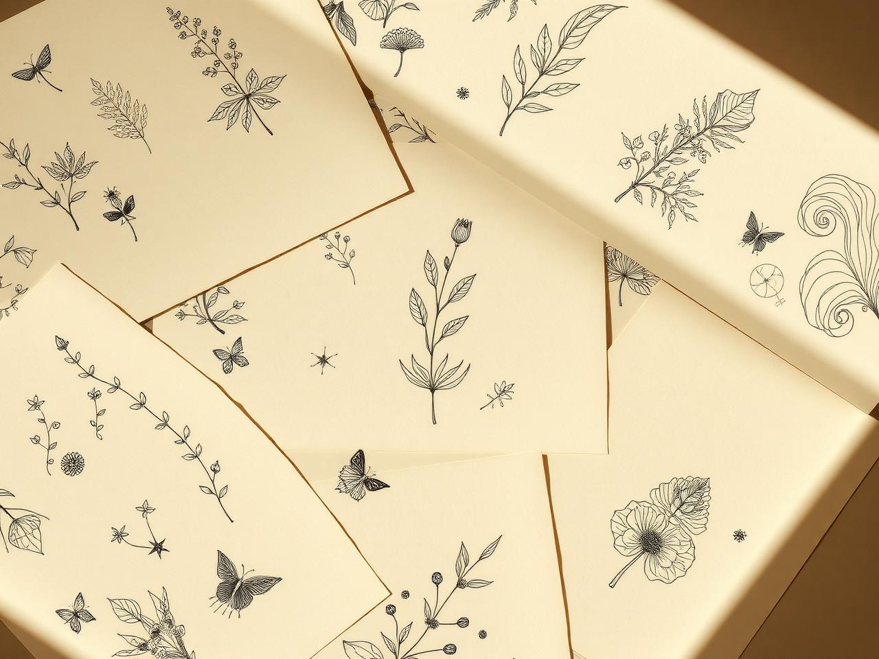
Negative space is not empty space. In fine-line work, it is structure. The open areas around a flower stem, a small animal, a constellation, or a piece of script are what keep the design legible over time. When we review a fine-line concept, we often ask what can be removed without weakening the idea. If the answer is 'quite a lot,' the design usually gets better.
Placement changes the whole drawing. A fine-line piece on the inner forearm has a different life than the same piece on ribs, wrist, ankle, hand, or sternum. Flat areas can hold delicate geometry and small botanical work more predictably. Areas that bend, stretch, rub, or see more sun usually need more space, stronger lines, or a simpler silhouette. This is not a reason to avoid those placements; it is a reason to design for them honestly.
The body also moves. A wrist bends. A forearm rotates. A shoulder rounds forward. A ribcage expands with breath. Designs that look perfect on a flat mockup can feel slightly wrong once they wrap around the actual body. Good fine-line artists account for that by placing the strongest axis of the design with the body, not against it.
Aging is part of the style conversation. Fine-line tattoos can age beautifully, but they ask for technical discipline: clean needles, patient linework, enough spacing, and a client who understands aftercare and sun protection. The most enduring small tattoos often look almost effortless because the difficult decisions happened before the appointment.
Reference images help most when they are specific. Instead of sending ten fine-line tattoos and saying 'something like this,' identify what you like: the thin botanical stem, the open spacing, the way the piece follows the forearm, the softness of the script, the lack of shading. Also include what you do not want. 'Not too dense' or 'not this fragile' can be just as useful as a favorite image.
Fine-line is not the right answer for every idea. If the concept depends on strong contrast, heavy symbolism, large color fields, or a design that needs to be visible from across a room, another style may serve it better. Sometimes the best fine-line advice is to make the tattoo slightly larger, simplify the subject, or choose an artist whose work sits between fine-line and illustrative.
When we help shape a fine-line brief, we are looking for the version that still feels quiet without becoming fragile. The goal is not the thinnest possible line. The goal is a tattoo that feels light on the body and still has enough structure to be worth wearing years from now.