How to choose the right tattoo style for your idea
How to connect the meaning, placement, scale, and mood of your idea to a tattoo style that can actually hold it.
Style is the part of a tattoo that most people pick last and should probably think about first. It is not just an aesthetic preference — it is a structural decision. The style determines how the design will read at arm's length, how it will age over twenty years, and which artists are even right to make it. Two tattoos with the same subject and the same placement can be entirely different objects depending on the style they are drawn in.
A useful way to start is with meaning. A quiet, private mark — something tied to a person, a year, a small turning point — usually wants a quieter style: fine line, single-needle, restrained dotwork. A piece meant to be seen and read across a room — a tribute, a declaration, a story — can carry the weight of bolder traditions: traditional, neo-traditional, blackwork, Japanese. Meaning is not a rule, but it is a strong nudge.
Placement and size narrow the field further. Small tattoos on thin skin — wrists, ankles, fingers, behind the ear — rarely hold dense detail well over time. Fine line and small-scale illustrative work tend to age more gracefully there. Larger, structural placements — outer arms, thighs, ribs, backs — can carry styles that depend on weight and saturation, like blackwork, Japanese, or traditional. Realism, in particular, almost always needs scale to breathe; a tiny realism portrait on a forearm rarely reads the way the reference does.
A short, honest map of the most common style families and where they tend to fit best.
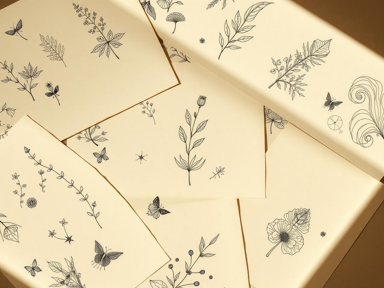
Fine line and single-needle. Quiet, modern, often small. Beautiful for botanicals, small symbols, delicate lettering, and private marks. Trades durability for softness — expect some fading and slight thickening over the decades, especially on thin skin.
Blackwork. Bold, graphic, built on solid black. Holds up exceptionally well long-term. Works at almost any scale but rewards larger placements where the negative space can do real work.
Realism. Photographic in feel — portraits, animals, objects rendered with shading and depth. Demands skill, scale, and the right artist. Usually a poor fit for very small or very curved placements, and tends to soften visibly over twenty years.
Traditional and neo-traditional. The American and European classical languages of tattooing — bold outlines, limited palette, time-tested compositions. Age remarkably well because they were designed to. Excellent for arms, chests, thighs, and anyone who wants a piece that will still read clearly at sixty.
Illustrative. The broad middle ground — anything from storybook line work to modern editorial styles. Highly artist-dependent; the same brief in two illustrative artists' hands will produce very different tattoos.
Lettering and script. Underrated and easy to get wrong. Word choice, font, spacing, and placement all matter. Many of the best lettering tattoos are done by artists who specialize only in lettering — the discipline is its own craft.
Color. Adds emotional weight and dimension, but also adds maintenance: colored ink fades faster than black, can be harder to remove or cover, and reacts differently across skin tones. A good colorist will be honest with you about what their palette will look like in ten years on your specific skin.
Geometric and dotwork. Pattern-driven, often symmetrical, frequently architectural. Looks striking when executed well, and unforgiving of imprecision. Suits placements where the body's geometry can be respected — forearms, calves, spines, chests.
None of these is universally best. The right style is the one that actually holds your idea on your body for your lifetime, drawn by an artist whose hand suits it. Picking a style you love but no one near you executes well is a common, expensive mistake; so is picking an artist you love but asking them to work outside their strongest style.
Once a direction is clear, artist fit becomes the next conversation. Most artists specialize, even the ones whose portfolios look broad. A fine line artist who occasionally posts blackwork is usually not the right person for a blackwork sleeve. The strongest tattoos tend to come from artists working squarely inside their main style, on the kind of project they have made many times before.
When a brief comes to us at InkLiaison, narrowing the style is often the first thing we do — sometimes confirming the direction the client already had in mind, sometimes gently pointing toward a related style that fits their idea, placement, and scale better. From there, matching becomes much easier: a clear style direction usually narrows our recommendation to a small, considered list of artists rather than a long one.
If you are stuck between two or three styles for the same idea, that is a useful place to be — and a good time to send the brief over.