Tattoo reference images: how to use inspiration without copying
How to use inspiration images ethically so your tattoo feels personal instead of copied.
Reference images are one of the most useful tools in the tattoo process and one of the easiest to misuse. Done well, they let an artist read your taste in seconds and translate it into something that fits your body and your idea. Done badly, they turn into a request to recreate someone else's tattoo on your skin — which is the wrong goal, and rarely produces the piece you actually want.
References exist to communicate. They are a shorthand for mood, line weight, composition, scale, and style — the things that are hard to describe in words and easy to show in images. They are not the design. The design is what an artist makes after reading the references, the brief, and the body.
Why copying another tattoo is not the goal. Most reputable artists will politely decline to recreate another artist's finished tattoo. There are good reasons for that: the original is someone else's work, made for someone else's body, and copying it is both ethically thin and creatively limiting. A direct copy almost never sits as well as the original did, because it was designed for a different person, a different placement, and a different hand. The better move is to use that piece as a reference for what you respond to, and let your artist draw something original from there.
Identifying what you actually like. The most useful skill in collecting references is being specific about what is pulling you in. Open an image you love and ask: is it the line weight? The composition? The negative space? The subject? The mood? The placement? Almost always, two or three things matter and the rest is incidental. Naming those two or three things is half the work of building a strong reference set.
What to collect references for. A few categories, in rough order of usefulness.
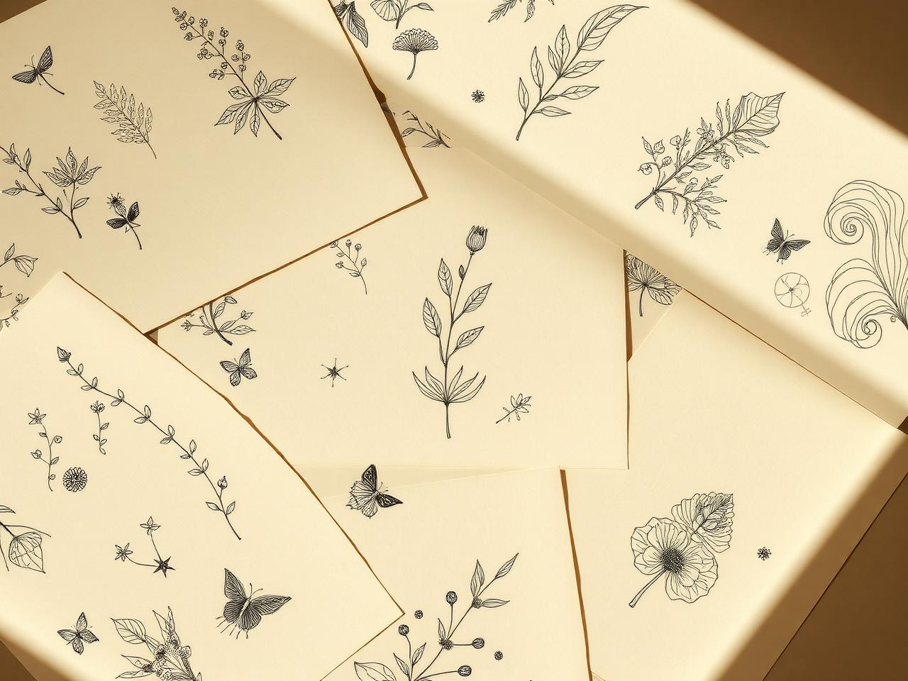
Mood. Two or three images that capture the overall feeling — quiet, bold, playful, serious, soft, structural. These can be tattoo images or not; sometimes a photograph, an illustration, or a piece of textile design communicates the mood better than another tattoo would.
Line weight. One or two images that show the kind of line you want — fine and patient, medium and confident, bold and graphic. Line weight is the single most important technical decision in many tattoos, and references make it concrete in a way words rarely do.
Composition. One or two images that show how elements are arranged in space — symmetry, asymmetry, density, the use of negative space, how a piece sits within its outer shape. Composition is what makes a tattoo read at arm's length, and it is often the part clients underestimate most.
Placement. One or two images of tattoos roughly the size and orientation of yours, on a similar body part. This helps the artist think about how the design will sit on the actual contour you have in mind, not on a flat sheet of paper.
Style. One or two clear examples of the style direction — fine line, blackwork, traditional, illustrative, geometric, lettering. If you are between two related styles, include one image from each and say so. Mixing five contradictory styles in one reference set tends to muddy the brief rather than clarify it.
How many references are useful. Three to six is usually right. Fewer than three leaves the artist guessing. More than ten becomes noise — every image dilutes the others, and the artist has to spend more time decoding the set than designing the piece. If you find yourself with twenty references, that is a sign to edit ruthlessly down to the ones that genuinely capture what you want.
How to explain references. The most helpful thing you can do is add a sentence under each image. Not a paragraph — a sentence. 'I like the spacing here, not the shading.' 'The line weight in this one is what I want.' 'This composition, but smaller.' 'This placement and orientation.' Two minutes of writing here saves an artist twenty minutes of guessing, and it almost always produces a better first sketch.
When a brief comes to us at InkLiaison, we read the references the same way an artist would. We look for the patterns across the set — the line weight that keeps appearing, the moods that repeat, the compositions you keep returning to. From there, we work with you to translate that pattern into an original direction, either through custom design with us or by matching you to an artist whose hand naturally produces work in that direction. The references shape the recommendation; they do not become the tattoo.
If you have a folder of references you have been collecting and you are not sure what they add up to, that is a good moment to send them over. Reading a reference set is one of the more enjoyable parts of what we do.